What makes one product stand out while another goes unnoticed on the same retail shelf? The answer often lies in the header card design. Small but costly design mistakes can reduce shelf appeal, even for high-quality products. Below, the most Common Mistakes When Designing Header Cards are explained, along with practical solutions to improve presentation and visibility. Read further in detail by reading below now!
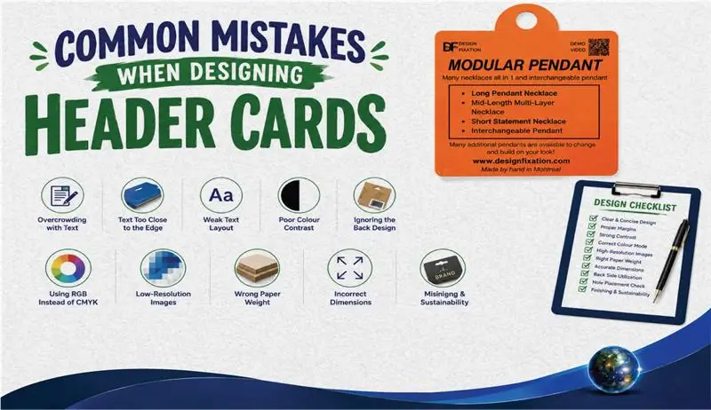
10 Common Header Card Design Mistakes You Should Avoid
Even the smallest design mistake is enough to reduce the impact of a header card on a retail shelf. The most common mistakes when designing header cards are often related to poor typography, cluttered layouts, incorrect sizing, and low-quality printing, all of which affect the presentation of the product and shopper attention. Below are 10 common mistakes when designing header cards, along with practical tips to avoid them and achieve a more professional retail display.
1. Overcrowding the Header Card With Too Much Text
The Mistake: Too many details, features, or long slogans are often crammed into a small space, and this remains one of the most common mistakes when designing header cards across custom header cards ordered by small and large brands alike.
The Fix: Only the brand name, product name, and one key benefit are kept on the card, with generous white space used around each element for clarity.
But excess text is not the only issue; a loss of consumer appeal is often traced back to cluttered layouts, and the next point near the edges is just as important. A single sentence describing the core benefit, paired with a clean logo, tends to communicate more than three paragraphs of dense copy ever could.
2. Placing Text and Logos Too Close to the Edge
The Mistake: Text and logos are often placed too close to the edges, where they are cut off during printing, and this is listed among the common mistakes when designing header cards most frequently reported by print shops.
The Fix: A safe margin is left inside the border for all important content, so nothing important is trimmed away during production.
Once the margins are sorted on printed header cards, one less item is checked off the common mistakes when designing header cards, and attention is needed on how the text itself is structured next. This particular error is rarely visible on a digital proof, since the file is viewed exactly as designed, but it becomes obvious the moment a cut is made, and a letter or logo edge is sliced away.
3. Weak Text Layout on the Packaging of the Product
The Mistake: All text is often kept the same size, or unreadable; decorative fonts are chosen, and weak typography remains a recurring entry among the common mistakes when designing header cards.
The Fix: The product name is kept large and bold, while simple, clean fonts are used for secondary details, correcting one of the common mistakes when designing header cards seen most often on crowded shelves.
Design errors in text sizing are only part of the problem, and colour is equally important, as explained next. A well-built hierarchy guides the eye in a predictable order: first the product name, then the benefit, then the finer print, instead of leaving a shopper to hunt for meaning across a flat, uniform block of text.
“My motto is strong packaging, clear addressing.” — Halldór Laxness
4. Poor Colour Contrast in Header Card Design
The Mistake: Text and background colours that blend are often used, and the card is made hard to read as a result, with colour accuracy frequently lost in the final print run.
The Fix: Dark text is paired with light backgrounds, or light text is paired with very dark backgrounds, so visibility is kept strong in both food packaging and cosmetic packaging environments.
Readability is affected by contrast, but the back of the card is a space that is frequently overlooked too, and this too counts among the common mistakes when designing header cards. Under warehouse or store lighting, subtle colour differences on screen are flattened even further, so a contrast check under a few different light sources is always a worthwhile step before a full production run is approved.
5. Forgetting to Design the Back of the Header Card
The Mistake: The reverse side is often left completely blank, and valuable space is wasted, adding one more entry to the list of common mistakes when designing header cards.
The Fix: Instructions, a QR code, or social media handles are added to the back, along with clear barcode placement, resolving another one of the common mistakes when designing header cards tied to wasted space.
Space is not the only thing forgotten on many bag toppers — the hole placement is another detail that is often missed. A blank back panel is essentially free advertising space left unused, and even a short line pointing shoppers toward a website or social profile turns a single purchase into a longer relationship with the brand.
6. Misaligned Hole Placement on Retail Header Cards
The Mistake: The hang hole is sometimes punched directly through the logo or important text, and a poorly placed euro hole is counted among the common mistakes when designing header cards most often flagged during quality checks.
The Fix: The exact spot for the hole is marked on the template before the design is finalized, so correct logo placement is never disturbed.
With the physical layout sorted, the digital colour settings, another frequent source of common mistakes when designing header cards, are looked at next. A template with the punch position marked in advance removes the guesswork entirely, and it also allows the same layout to be reused confidently across future print runs without a fresh round of checking.
7. Using RGB Instead of the Correct Print Colour Mode
The Mistake: Designs are often created in RGB mode, and the final printed colours are found to be dull and different from what appeared on the screen a classic case among the common mistakes when designing header cards, which is why CMYK printing is recommended from the very first draft.
The Fix: The digital design software is set to the correct colour mode before the design is started, and print resolution is checked carefully at the same stage.
Colour mode is important, but compliance labeling is just as critical for a clean, shelf-ready final print. A quick proof check between the on-screen file and a physical sample, before bulk printing begins, is one of the simplest ways for this particular error to be caught early, well before hundreds or thousands of cards are affected.
8. Low-Resolution Images in the Packaging of the Product
The Mistake: Blurry, pixelated graphics downloaded straight from the internet are often used, and this sits high on the list of printing mistakes tied to die-cut header cards in particular.
The Fix: Vector graphics or high-resolution images are used instead, and every fold line is checked carefully so no artwork is distorted after production.
Sharp images are important, but packaging durability, considered underneath them, is just as essential, and both remain common mistakes when designing header cards worth double-checking before final approval. A file pulled from a social media post is rarely built for print, since screen graphics are usually far lower in resolution than what a professional printer requires for a crisp result.
9. Choosing the Wrong Paper Weight for Header Cards
The Mistake: Paper that is too flimsy to bear the weight of the product is often chosen, resulting in bending, ripping, or sagging, especially when thin cardstock is used in place of sturdier paperboard.
The Fix: A thicker material, sometimes a heavier kraft paper blend, is used instead, avoiding yet another one of the common mistakes when designing header cards reported by retailers, so the card is kept upright on shelves without extra support.
Paper weight is important, but the final dimensions of the card are equally essential to get right. A card that sags on the shelf within a day or two of restocking reflects poorly on the product beside it, no matter how strong the artwork or the offer printed on the front happens to be.
10. Wrong Header Card Dimensions for the Poly Pouch
The Mistake: The header card is often made wider or much narrower than the plastic bag it is attached to, and finishing touches such as a matte finish or a gloss finish are wasted when the fit itself is wrong.
The Fix: The bag is measured first, and the card width is matched exactly to the bag width, before spot UV or any other decorative coating is applied. A template built from an actual sample bag, rather than a guessed measurement, is the most reliable way for this mismatch to be avoided altogether, especially when several product sizes are being packed under the same product line.
Looking for customized retail packaging for your products? Explore Retail Packaging solutions designed for professional presentation of products across a wide range of industries.
Finishing And Sustainability Considerations
Beyond the ten mistakes above, premium finishing options such as foil stamping, embossing, or debossing are sometimes added to raise shelf presence further, though these are used sparingly, since overuse is also counted among the common mistakes when designing header cards.
- Recyclable Packaging: Frequently selected to reduce packaging waste and support sustainability goals.
- FSC-Certified Paper: Commonly preferred by brands seeking responsibly sourced paper materials.
- Eco-Friendly Packaging Options: Increasingly requested by environmentally conscious businesses.
- Sustainable Inks: Often chosen instead of conventional ink formulas to support more sustainable printing practices.
Primary Role: The primary role of header cards is to display items on the shelves and attract shoppers’ attention at the point of sale.
If you would like to learn how header cards contribute to stronger shelf presence and better presentation of the product in retail environments, explore a detailed guide on How Header Cards Help Increase Product Visibility.
Whether you are launching a new product or expanding an existing product line, explore our Custom Packaging for Small Companies for customized packaging across a wide range of industries.
Conclusion
The common mistakes when designing header cards have been explained above, along with practical solutions for each one. Mistakes related to typography, spacing, sizing, printing, and colour are often reflected in the presentation of the product on retail shelves. When these points are considered during the design process, better readability and stronger shelf presence are achieved. A well-planned header card also reflects the reputation of the brand and contributes to a more professional retail presentation through accurate printing, suitable materials, and carefully planned dimensions.
Frequently Asked Questions (FAQs)
What is a header card used for?
A header card is used at the top of a poly bag or pouch, mainly for representing the name of the brand and also for adding a barcode to be displayed for retail hanging.
Why is the correct colour mode preferred over RGB for printing header cards?
It is preferred because printed colours are matched closely to what appears on screen, while RGB ones are converted with visible colour shifts during production.
What paper weight is recommended for header cards?
A minimum of 300 GSM or 14pt material is recommended, so the card is kept upright on retail shelves without bending.
How much margin should be left around text and logo?
A margin of at least 3mm (0.125 inch) is recommended inside the border, so no text or logo is cut off during trimming.
Is the back of the header card used for additional information?
Yes, the back of the header card is often used for instructions, a barcode, or scannable details, instead of being left blank.
Are header cards offered in customized or personalized designs?
Yes, personalized header cards are offered in custom shapes, sizes, colours, and finishes, based on the requirements of the brand and the product.
Where is the hanging hole usually placed on a header card?
It is usually placed at the top centre of the card, and its exact position is marked before the design is finalized, so no text or logo is affected.
Where are header cards ordered from?
Custom header cards are ordered from Universal Packaging, where sizes, materials, and finishes are adjusted according to the needs of the brand.