Designing soap packaging may look simple, but one wrong decision can cause even the best product to be completely ignored. Most brands invest in quality ingredients but forget that packaging is the very first thing a customer sees before buying. From poor font choices to incorrect colour selections, these common mistakes result in reduced sales every single day. If you are want that the product of your brand stand out, scroll down and find out which Common Mistakes To Avoid When Designing Soap Packaging before it’s too late.
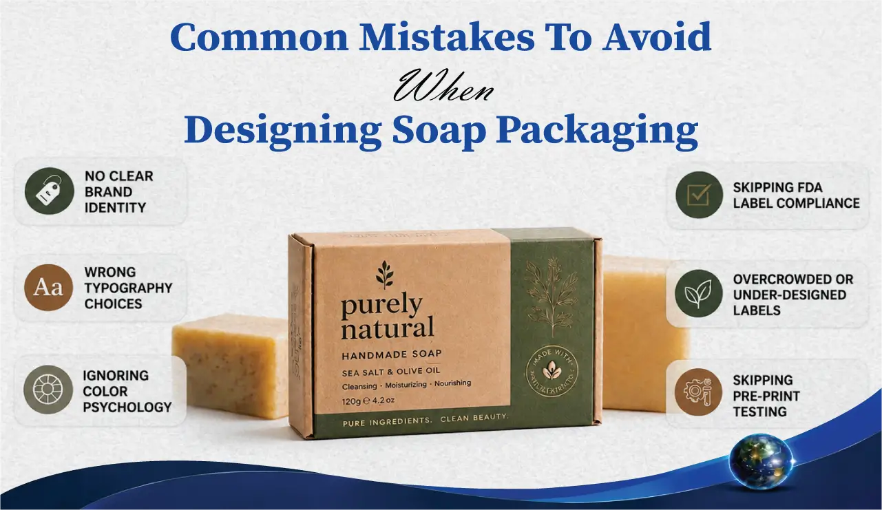
Top Soap Packaging Design Mistakes You Should Avoid
Strong soap packaging begins with clear planning; many brands overlook this and end up with confusing visual results that directly affect how customers perceive the product on shelves. When layout ideas, typography, and design style are not aligned from the start, the final packaging fails to deliver a clear and professional message. This is why understanding common mistakes to avoid when designing soap packaging is important for building a strong and professional presentation of the product that actually attracts buyers instead of confusing them.
Custom-printed soap boxes have a clear visual strategy from day one with every design decision that strengthens the overall message of the brand. A well-organized approach always gives a clean, balanced, and visually appealing design that customers can easily understand and trust.
Mistake 01 — No Clear Identity of Brand
A clear identity of packaging is often missing when designing each product differently without a unified visual method, that makes the entire product look unorganized. It breaks recognition and weakens the overall presence of the brand in the market because customers are unable to visually link products under one brand.
Understanding common mistakes to avoid when designing soap packaging includes learning how consistency plays a major role in brand recall and long-term recognition. Logo placement strategy in packaging is one of the most overlooked factors that directly affects how customers visually identify and remember a brand across multiple products. When colour, font, and theme vary too much from product to product, customers fail to connect them with the same identity of the brand.
IMPROVED POINTS:
- Logo Placement Strategy: Logo placement is one of the most important factors that directly affects customers’ ability to memorize the name of the brand with the logo.
- Bolding Font Style: Same font across products maintains visual unity and identity of the brand.
- Visual Theme: Repeated design themes enhance brand connection and market consistency.
- Message Style: Consistent colour avoids confusion across the line of products and improves trust perception.
Mistake 02 — Wrong Typography Results Difficult Readability
Typography is one of the most common mistakes to avoid when designing soap packaging. Fonts selected for visual style rather than readability often create confusion when customers try to quickly read product information. Although complex or decorative fonts may look attractive at first glance, they can make important details difficult to read on actual packaging.
Soap packaging label design should always prioritize clean and readable typography so customers can easily understand the information without any problem. The clarity is improved, user experience is enhanced, and the overall effectiveness of packaging in retail environments is increased by using simple font choices. If customers can’t read it quickly, they won’t buy it, that clearly highlights common mistakes to avoid when designing soap packaging and the importance of keeping typography simple.
IMPROVED POINTS:
- Font Choice: Reading speed is improved, and customer confusion is reduced by using simple, clean fonts throughout the packaging design.
- Text Size: Key details are highlighted clearly, and overall visibility is enhanced by maintaining a balanced text sizing.
- Line Spacing: Reading flow is improved, and visual difficulty is reduced by applying proper and consistent line spacing across all text.
- Word Alignment: Clarity is increased, and a professional look is created by using organized and structured word alignment in the layout.
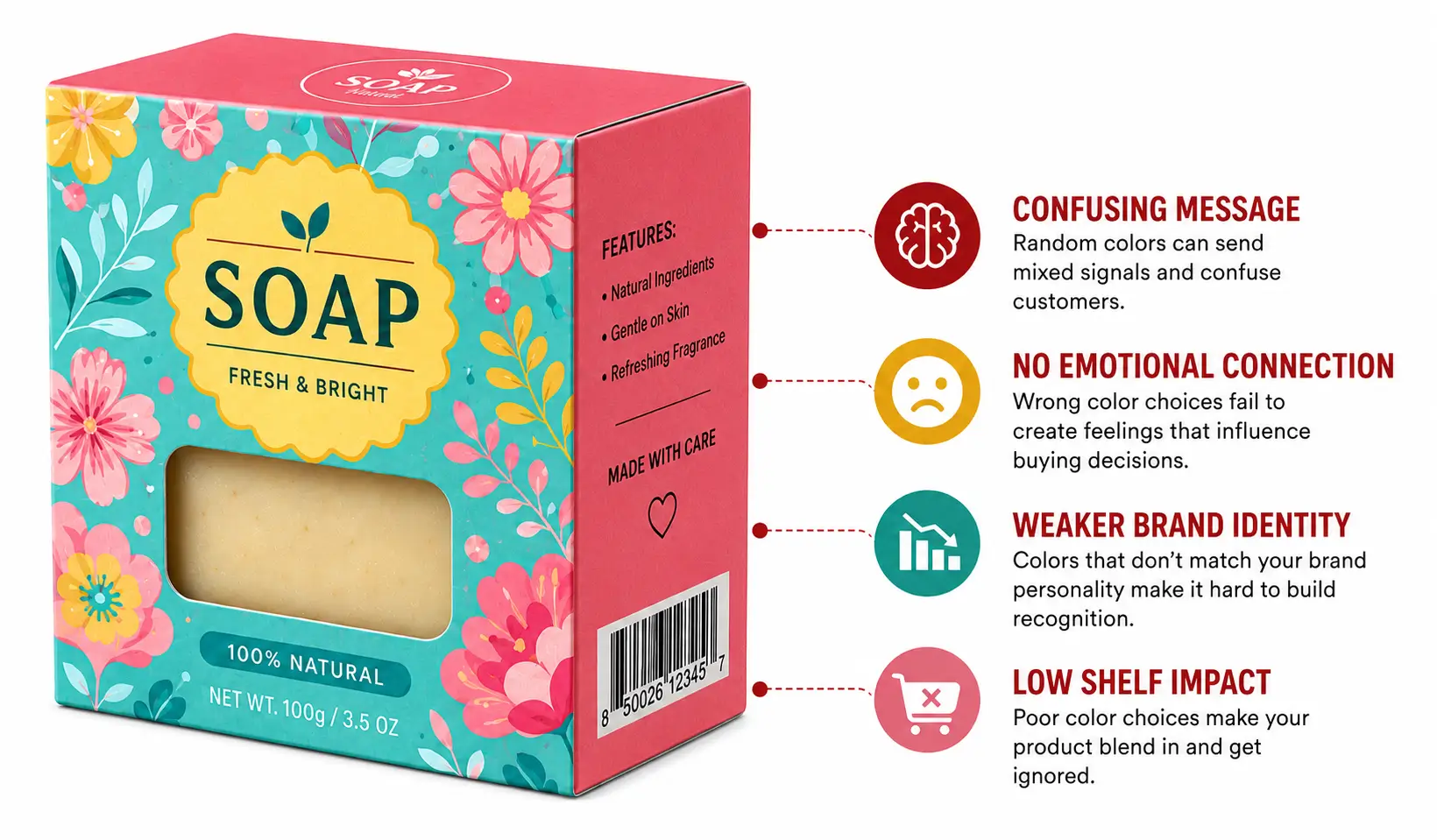
Mistake 03 — Ignoring Colour Psychology Completely
Poor colour selection is one of the common mistakes to avoid when designing soap packaging. colours are often chosen randomly without understanding how strongly they influence customer perception, which can weaken the emotional impact of the product. Every colour conveys a message and plays an important role in how a product is positioned in the market. Minimalist packaging design shows that a limited colour palette used with clear intention often creates a stronger emotional connection and better recognition than random colour combinations. A well-planned colour scheme enhances visual appeal, strengthens brand identity, and ensures consistency across product lines.
IMPROVED POINTS:
- Soft Tones: Create a calm, natural, and clean impression that suits products of soap.
- Strong Shades: Attract attention when used strategically and in balanced composition.
- Coluor Balance: Maintains the entire design and improves visual stability.
- Tone Consistency: Builds strong recognition and supports the brand with customers.
Explore premium Soap Boxes solutions now to make your packaging more professional and sales-driven without any mistakes!
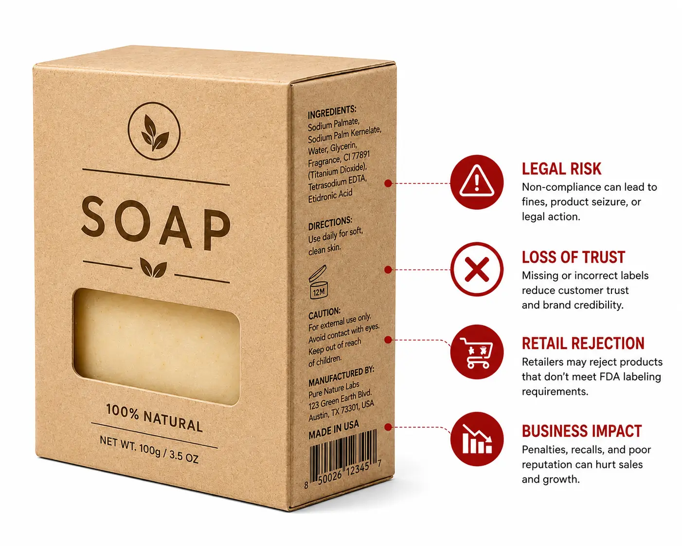
Mistake 04 — Skipping FDA Label Compliance 21
Disorganized label information is one of the common mistakes to avoid when designing soap packaging. Label content becomes ineffective when it is not arranged according to proper standards, which can reduce both customer trust and the professional credibility of the product. Missing, unclear, or poorly structured details on the label often create confusion for customers who rely on packaging information to make purchasing decisions. Soap packaging should present accurate labelling in a clear and organized format so that customers can easily understand important details such as ingredients, usage instructions, and warnings. Well-organized label information also enhances the customer experience, and brands avoid one of the most common mistakes to avoid when designing soap packaging.
IMPROVED POINTS:
- Label Text: Readability is improved, and customer loyalty is built by placing label text clearly and accurately.
- Information Order: Understanding is increased step by step by maintaining an organized and logical information flow.
- Spacing Control: Stuck appearance is prevented, and visual clarity is improved by controlling spacing effectively.
- Detail Accuracy: Correct information is provided, and misinformation is avoided by ensuring full detail accuracy.
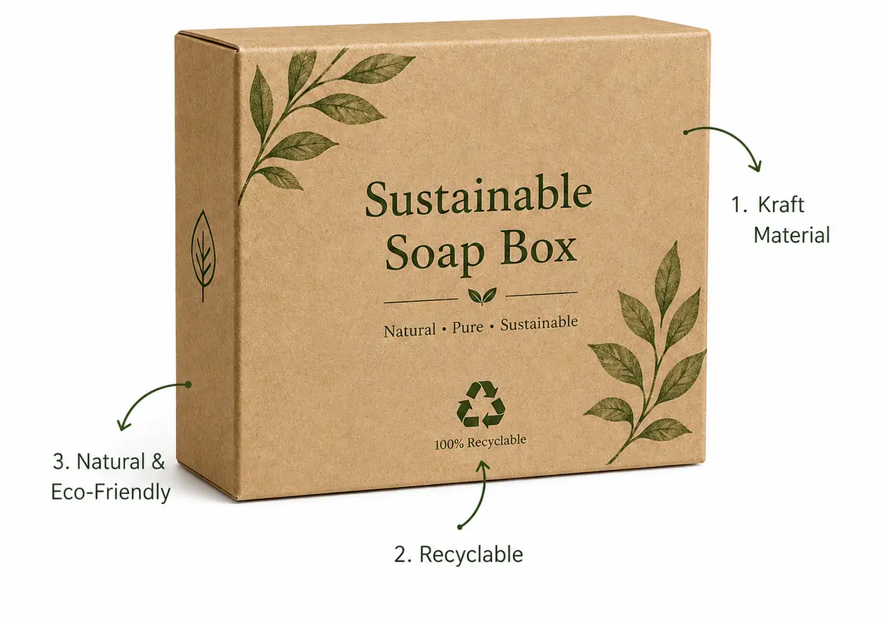
Mistake 05 — Eco-Friendly Packaging Is Not Optional
Ignoring sustainable materials is one of the common mistakes to avoid when designing soap packaging, as modern consumers prefer environmentally responsible packaging solutions. Eco-friendly packaging materials are no longer just a preference but a powerful signal of responsibility and real commitment to environmental values. Soap Boxes Kraft are widely used in eco-friendly packaging because they have durability, a natural look, and strong branding appeal without compromising quality of design. When brands continue using outdated or non-sustainable packaging options, it creates a clear gap between the identity of the brand and customer expectations. On the other hand, sustainable materials not only result in enhancing value but also build stronger customer trust, loyalty, and long-term business growth.
IMPROVED POINTS:
- Material Choice: The image of the brand is increased, and customer perception is improved by choosing natural and eco-friendly material options.
- Recycling Direction: Environmental responsibility is supported, and modern thinking is promoted by providing clear recycling directions.
- Waste Control: Unnecessary packaging is reduced, and overall efficiency is improved by controlling and minimizing waste.
- Packaging Type: Clarity is maintained, and eco-friendly appeal is achieved by using a simple and clean packaging design.
“Recycling, packaging, businesses are changing all of those things because that’s what consumers want.” — Jerry Greenfield
In markets like Soap Packaging Canada, brands are focusing on sustainable and high-quality packaging solutions to connect with modern customer expectations.
Mistake 06 — Overcrowding Or Under-Designing Labels
Imbalanced information is one of the most common mistakes to avoid when designing soap packaging. Label design often becomes ineffective when it includes too much or too little information, as both approaches negatively affect readability and visual balance. Overcrowded layouts can appear messy and difficult to read, while overly minimal labels may feel incomplete and unprofessional. Soap boxes made from kraft paper and paperboard materials clearly demonstrate how a clean and minimal label approach can create strong visual impact without overwhelming customers with excessive information. A well-balanced design consistently results in improving user experience and hence helps customers to quickly understand key product details.
IMPROVED POINTS:
- Text Stuck: Don’t add too many words, as it results in reduced clarity and slows down reading.
- Empty Space: Likewise, don’t add too little information is incomplete and weak.
- Spacing Layout: Uneven spacing disturbs design flow and readability, so maintain it.
- Alignment Style: Aligning the styles results in improving professional appearance and visual order.
Mistake 07 — Unboxing Experience Often Ignored
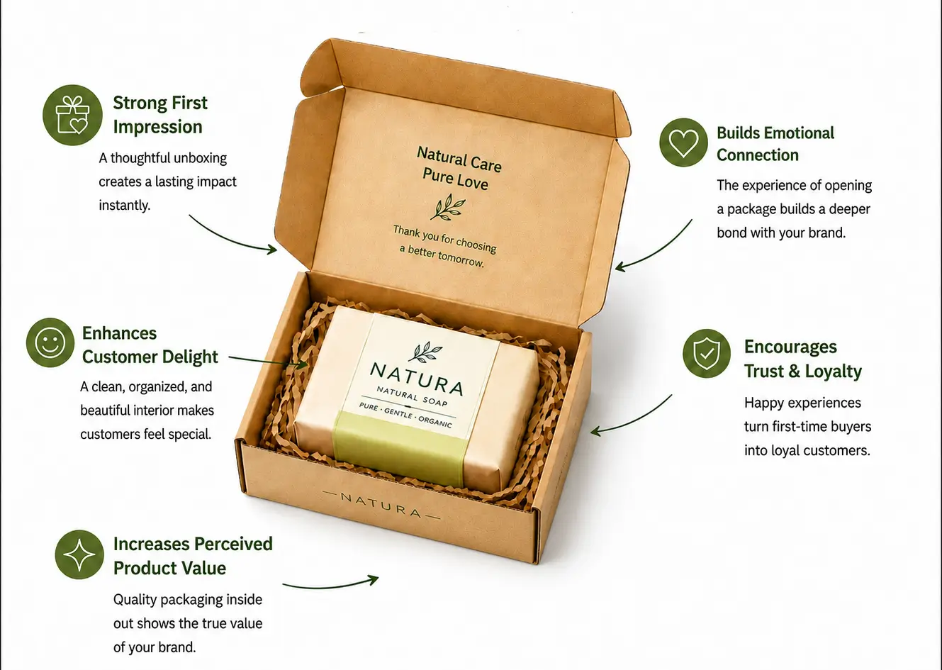
Ignoring the unboxing experience is one of the most common mistakes to avoid when designing soap packaging. The inside packaging experience is just as important as the outer design, yet it is often overlooked by many brands that focus only on external appearance. The unboxing experience plays a key role in shaping how customers emotionally connect with a brand when they receive and open a product for the first time. The first impression after opening influences how customers remember and evaluate the brand. A clean, organized, and visually appealing interior consistently enhances perceived product value and improves overall customer satisfaction. Don’t stop at outer design; design the full experience!
IMPROVED POINTS:
- Inside Layout: First impression after opening is improved by using an organized and well-planned arrangement.
- Opening Flow: Overall user experience is enhanced by ensuring a smooth and easy opening flow.
- Inner Design: Visual comfort and premium feel are added by maintaining a clean and refined inner finish.
- Order Placement: Clarity and quality of presentation are improved by using an organized and structured layout
Mistake 08 — Designing for Everyone Means Nobody
Lack of Focused Design is one of the most common mistakes to avoid when designing soap packaging. A common issue occurs when too many design ideas are combined into a single layout, which reduces focus and creates visual confusion for customers. Effective retail branding must have a clear and intentional design direction that speaks to a specific target audience rather than attempting to appeal to everyone at once. When too many designs are added without purpose, the core message becomes unclear and less impactful. Simple, targeted, and intentional design consistently performs better in competitive retail environments. A focused design always wins over a crowded one.
IMPROVED POINTS:
- Style Mixing: Confusion is created, and visual strength is reduced by mixing multiple styles together.
- Message Dilution: Brand communication is weakened, and clarity of identity is reduced by diluting the core message.
- Visual Conflict: Design flow and balance are disturbed by overlapping and conflicting visual features.
- Focus Loss: Design clarity and product understanding are reduced by losing focus in the overall layout.
For brands aiming to improve soap packaging design, universalpackaging offers custom-printed soap boxes designed to help avoid common design mistakes while enhancing branding, presentation of product, and shelf appeal more professionally and cost-effectively.
Mistake 09 — Skipping Pre-Print Testing Always
Skipping Final Proofing Before Printing is one of the most common mistakes to avoid when designing soap packaging. Final checking before printing is often ignored, which leads to costly and permanent errors that could have been easily prevented. UV coating finish packaging should always be tested before final production to ensure the coating applies evenly and does not distort colours, text, or other design factors on the finished box. Small mistakes in text, spacing, or colour become irreversible once the packaging is printed in bulk. A proper final review ensures a refined, accurate, and error-free design.
IMPROVED POINTS:
- Text Check: Spelling errors are prevented, and accuracy is improved by thoroughly checking all text content.
- Layout Review: Visual balance and organized quality are improved by carefully reviewing the overall layout.
- Colour Check: Correct colours are ensured, and consistency in printing is maintained by performing a detailed colour check.
- Print Preview: Final production mistakes and losses are avoided by reviewing a complete print preview before production.
“My motto is strong packaging, clear addressing.” — Halldór Laxness
Mistake 10 — Ignoring Consumer Trust Signals
Weak Visual Clarity and Lack of brand trust signals are one of the most common mistakes to avoid when designing soap packaging. Trust plays a major role in packaging success, and it is strongly influenced by how clean, clear, and organized the design appears to customers at first glance. Brand storytelling in packaging helps build emotional trust by communicating the original values of the brand, product reliability, and customer care through every visual and textual element on the box. Confusing or cluttered packaging reduces customer confidence and makes the product feel less reliable. A well-organized design consistently builds stronger trust and improves overall brand perception.
IMPROVED POINTS:
- Information Clarity: Understanding is improved, and confusion is reduced by maintaining clear and precise information.
- Design Simplicity: Readability is increased, and customer trust is built by keeping the design clean and simple.
- Detail Placement: A smooth and natural flow of information is achieved by placing details in a well-organized order.
- Visual Order: Perception is improved, and professional appeal is enhanced by maintaining a structured and consistent visual order.
By overcome from these all mistakes, you can achieve benefits for your product, brand, and many other, wanna know let’s started to readin g the next blog and learn the Benefits Of Custom Printed Soap Boxes.
Conclusion
Looking at all the points discussed above, successful packaging depends on avoiding small but important design errors that directly affect customer perception and buying decisions in the market. This guide on common mistakes to avoid when designing soap packaging highlights how planning, consistency, typography, colour psychology, and clarity all work together to create effective packaging. When these mistakes are corrected, packaging becomes more professional, readable, and visually appealing, ultimately improving brand performance, customer trust, and visibility of the product on shelves.
Frequently Asked Questions (FAQs)
What role does customization play in soap packaging design?
Customization plays a key role for brands to create unique packaging based on target audience, product type, and the identity of the brand. From colour selection to box style, everything can be personalized to improve recognition of the brand and make products more appealing in a competitive market.
What is the most common mistake in soap packaging design?
The most common mistake is a lack of consistency in design factors like colour, typography, and layout. This results in confusion and weakens recognition; that is a key issue highlighted in common mistakes to avoid when designing soap packaging.
How does typography affect soap packaging effectiveness?
Typography impacts readability and clarity. If fonts are too decorative or hard to read, customers may ignore the product entirely. Clean and simple fonts always result in improving communication and trust.
Why is colour psychology important in soap packaging?
Colours attract emotions and buying decisions. Soft tones result in a natural feel, while strong shades attract attention. Using the right colour strategy is a major part of common mistakes to avoid when designing soap packaging.
What happens if soap packaging is too crowded with information?
Overcrowded packaging lessens readability, and the design looks unprofessional. Customers may feel overwhelmed and lose interest in the product. Balanced spacing always results in improving user experience.
How does eco-friendly packaging impact customer trust?
Eco-friendly packaging results in improving perception of the brand because modern customers prefer sustainable products. Ignoring this factor is one of the key common mistakes to avoid when designing soap packaging in today’s market.
Why is pre-print testing necessary before final production?
Spelling errors, layout issues, and colour mismatches are some of the common mistakes to avoid when designing soap packaging, and these issues are usually detected before mass production through pre-print testing. Completing this testing process helps prevent costly mistakes and ensures a professional final output.
How does packaging design influence customer trust?
Instant trust is built by using clean, clear, and well-structured packaging. Customer confidence is reduced and buying decisions are negatively affected by confusing or poorly designed packaging.
How can a brand avoid mistakes in soap packaging design?
Brands can avoid mistakes by focusing on consistency, readability, colour psychology, proper spacing, and testing before production. These principles summarize common mistakes to avoid when designing soap packaging, and hence professional, market-ready packaging is created.
This is really interesting, You’re a very skilled blogger. I’ve joined your feed and look forward to seeking more of your magnificent post. Also, I’ve shared your site in my social networks!
Harika bir paylaşım, özellikle konunun önemli detayları oldukça net bir şekilde açıklanmış. İnsanları çeşitli karmaşık anahtar kelimelerle yormak yerine, okumaktan keyif alacağı içerikler her zaman daha iyidir. Kaliteli paylaşım adına teşekkür eder, paylaşımlarınızın devamını sabırsızlıkla beklerim.
I appreciate you sharing this blog post. Thanks Again. Cool.
I appreciate you sharing this blog post. Thanks Again. Cool.
Very well presented. Every quote was awesome and thanks for sharing the content. Keep sharing and keep motivating others.
Hocam detaylı bir anlatım olmuş eline sağlık
Very well presented. Every quote was awesome and thanks for sharing the content. Keep sharing and keep motivating others.
very informative articles or reviews at this time.
Emeğinize sağlık, bilgilendirmeler için teşekkür ederim.
Hocam detaylı bir anlatım olmuş eline sağlık